How to generate Bar Graph using Matplotlib Library
Bar chart is a special type of graph
in which numerical values of some data are represented by rectangular bars of
equal widths among some discrete set of items to which it varies its length.
This type of charts has a
discrete range of data which helps in providing visual representation of categorical
data.
For using Matplotlib library for
plotting, you must first have to import Matplotlib library and use functions
provided by this awesome library. Also, you will use inline magic function %matplotlib
inline so that you may display resultant figure after every line of code
 In[1]: import matplotlib.pyplot as plt
        %matplotlib inline
Now you will define data of populations and years with
variable name pop and years respectively;
 In[2]: pop=[1.2, 1.4, 1.5, 1.6, 1.3, 1.5]
        years=[2005, 2007, 2009, 2011, 2013, 2015]
In the following, you will plot bar chart using bar( ) function
with arguments defined inside it. You will notice that we have used first years
as component of x-axis and second argument pop as component of y-axis and
finally in the last argument we defined width of bar.
In[3]: plt.bar(years, pop, width = 0.5)
From the above command we will get bar char as shown in
Figure 1 below;
 |
| Figure 1: Plotted Bar Chart |
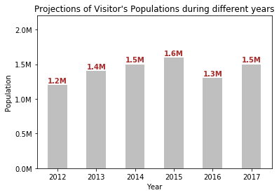
Now you will customize different properties of above Bar chart for better Visualization;
 In[4]: plt.bar(years, pop, width=0.5, color='gray', alpha=0.5 )
        plt.xlabel('Year')
        plt.ylabel('Population')
        plt.title('Visitors Population Projections during different years')
        plt.ylim(0,2.2)
        plt.yticks([0.0,0.5,1.0,1.5,2.0],['0.0M','0.5M','1.0M','1.5M','2.0M'])

        for x, y in zip(years, pop):
            plt.text(x, y+0.03, str(y)+'M', ha='center', fontsize=10, fontweight='bold', color='brown')
While running the above cell in Jupyter Notebook, you will
be displayed customized Bar chart as shown in Figure 2.
Now
we will discuss below about lines of code that we have used in above cell i.e. In[4]
for customized plot shown above in Figure 2.
- In the first line, we used bar function to generate bar chart as same as discussed before. Additionally, we used arguments i.e. color=’gray’ and alpha=0.5 for setting color and color’s opacity of bars respectively.
- In the next two lines, we set labels of x-axis and y-axis using functions xlabel( ) and ylabel( ) respectively.
- In the fourth line of code, we have set title on top of graph as shown in Figure 2.
- Then we have set the limits of y-axis to be displayed on graph using function ylim( ) where we put first argument as lower bound value and second argument as higher bound values.
- In the next line of code we have defined ticks and modified labels on y-axis using function yticks( ), in which we have entered first argument as points of ticks to be displayed and in the second argument we have replaced its values to other string values for each points.
- In the final line of code, we used for loop to iterate for each bar point and displayed values or labels of bars on its top using function text( ), in which we set arguments to set position of labels, its color, font-style, font-size, style of horizontal alignment.


This comment has been removed by a blog administrator.
ReplyDelete